Congratulations to Charlie, Freeha, Kai, Mahalia and Niamh, our first Duke of Edinburgh’s Silver Award group, for successfully completing their two-night camping expedition in the wilds of the Peak District.
Four returning members from last year’s Bronze Award were joined by a new team member, who worked diligently together to meet the requirements of the Silver Expedition, part of which is a written report and presentation.
The theme adopted by the group was to determine whether signage and stiles within the Peak District National Park are accessible for visually impaired people.
This is what the team reported.
As detailed in the following pictures, the team found a whole host of issues, ranging from rotting wooden signs, overgrown signs and stiles, lack of tactile footpath signs and a lack of contrasting colours.

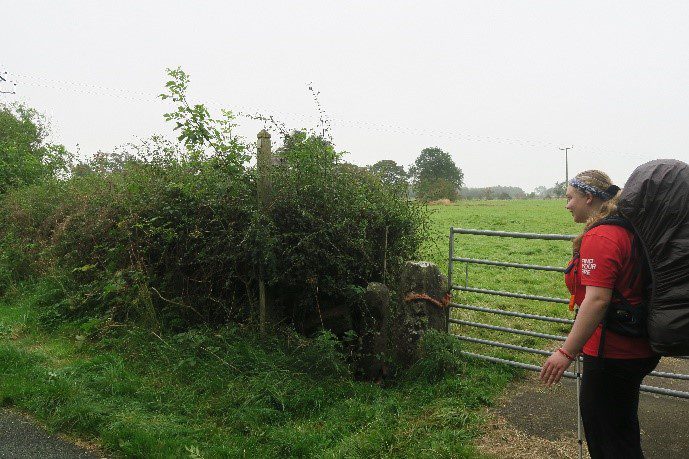
One member of the group in a red t-shirt, standing in front of a metal gate into a field, next to the gate is the stile, which has the gate tied to it using an orange rope. The sign to identify this as a footpath has become overgrown with vegetation.

A tall stile, in which the wood and the stone are very similar colours, the footpath sign is in too small to identify in the top left-hand corner of a wooden post, whilst the colour of this arrow contrasts the background, it is a very similar colour to the wood.

This picture shows the group on the other side of a stile, which is very thing and was not easily identifiable to the group after looking for it for 15 minutes, it also has two steps below it before you could walk through the stile. The stones were a very similar colour and when viewed from an angle, not easily identifiable as a stile location.

This picture shows a stile in which a large rock had been placed to block the entrance/exit from the stile for any animals to escape, as well as two planks of wood covering the width of the stile at shin height, this mean the group had to step over the planks, onto the rock and then a large step down to the ground, the footpath sign to the top right of the image had been covered up by some plastic debris and was not easily identifiable.
On multiple occasions while following their maps, the group walked past the signs or stiles because they were not clear and obvious, with one of the biggest challenges being a lack of contrast within the colours of directional signs. For example, wooden footpath signs often blended in to the surrounding shrubbery making it difficult for them to identify. As well as the footpath signs blending in to the surrounding background, the stiles often did to. When entering a field, they reported that it was often difficult to determine where the exit to the field was. This was because from looking at a distance, they saw no clear difference as to where the wall ended, and the style started.
Another issue raised was the construction method used within some of the stiles, particularly those with stones placed to block a stile entrance or exit. These stones need to be in place to stop animals from leaving a field, but it was a hazard for the group and could probably be an issue for someone who has sight too. Finally, the last issue that they found with the signage and stiles was the lack of tactile signs. Visually impaired people often rely on other senses, with the primary sense being that of feeling. The group usually require a more tactile resource to guide us where to go, instead of a visual resource. The group reported that they did like is that there was a clear attempt to make the footpath signs tactile by indenting arrows and lettering. However, they pointed out that debris can get caught in these indentations which in some cases the indentation disappear over time.
So, what did the group think could be improved?
They thought of three ways to help improve signage and stile within the Peak District National Park Area:
- Cutting back the shrubbery and overgrown branches. Preventing the stiles and signs from becoming hidden and, therefore, blending into the surrounding environment, posing a benefit to all park users, not just those with visual impairments.
- The use of contrasting colours on stiles, again to benefit all park users, makes it easier to see from a distance and at a close range. For which the group recommended blue or red as these colours contrast with green grass and grey stone walls.
- Signage could be made from harder wearing and less malleable materials. For example, metal. This is less likely to be affected by hardened weather conditions, easier to clean and identify, and can be pressed like the one below to allow visually impaired park users to use their sense of touch to identify where they need to go. Below is a metal sign which had raised letters and arrows, which gave the group a clear tactile resource and provided a clear contrast of colours.

A large green metal public footpaths sign, on top of a post, in the middle of a field which has paths on it. The sign has 3 arrows which direct the reader to Wetton (ahead), Wetton Mill (right turn) and Alstonefield (left turn).


Leave A Comment